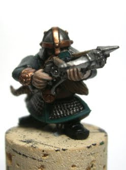
OK. So, onto a new army project. The dwarfs. I mentioned before that I was trying to steer clear of the typical dwarf schemes (these being blue/khaki and red/white). I would still like to but not sure what scheme to use. Any suggestions are welcome. On my first test dwarf I have gone for a turquoise/grey scheme. I like it quite a bit. The turquoise (maybe a tad too blue) gives it a nice bright colour allowing it to pop a bit, the grey acts as a neutral colour - and both are more in the 'cool' group. But I'm not entirely sold just yet. Here he is;


I haven't used gold on purpose. I plan to use it only on characters, longbeards and hammerers to set them apart from the rest, who will be using bronze as their secondary metallic colour.
And now I want to grumble.
So, I was looking through the dwarf army book for ideas and I quickly came to the conclusion that its pathetic. GW in their wisdom decided to deny a cohesive looking army to the dwarfs, instead opting for multiple shades and colours in a solitary unit; making it look ratty and disparaging. I know my dwarf fluff well enough to know that dwarf armies are all drawn from different clans, most of which will adopt a different look when fighting alongside other dwarfs. Most know this and the method they use to represent this fluff aspect is to use a different method of applying the same scheme, usually to the shield. For example, you might have one unit with the scheme split horizontally and another who's goes vertically. Its not difficult and easy to explain, whilst keeping the army on the whole looking like one army.
The GW studio army looks horrendous, being a mass of different shades of a number of colours. It is a shame, because when it comes to a uniformed looking army, the dwarfs pull this look off very well. It suits their large deep blocks, banners and war machines. It bothers me, and seems like GW just didn't care at the time of production. For shame GW. The dwarfs need love as well, they are a staple of the Fantasy world.

Looks great very nice colour scheme and great shading on the armoured areas.
ReplyDeleteI like it quite a bit. It looks both bright and muted at the same time.
ReplyDeleteThanks. I might have another go tomorrow, try and change a couple of things. If I like it, that'll be my army colour. =D
ReplyDeleteNice looking Dwarf, I think your turquoise/grey scheme works rather well.
ReplyDelete